My Comparison of Paint: Farrow & Ball versus Benjamin Moore Paint
Which paint is better, Farrow and Ball or Benjamin Moore? Here’s my comparison of the two paints. One of the most frequent discussions on Instagram is which paint to use, and why? After using both of these brands for 9 years, I’m going to pro/con the two brands and share my experiences. Before we go any further, I want to disclose both brands have gifted me paint to use however I’ve never had a paid sponsorship with either brand. Because both brands have gifted me paint, I’ve been able to try many finishes and different lines within the brands. I’m going to spill the tea, unfiltered and unsweetened.
I’ll also say: I’m really sensitive to color and finish. If I sound like I’m obsessing, I am. I have years working as a graphic designer, art director and creative director with Pantone and creating custom colors on printing presses, then my career as a photographer (always color correcting) and now as an interior designer. When I choose color for my home or design project, all that experience is filtered into my choices.

Farrow & Ball Paint
This British brand started making waves in the US right around the time we purchased our house in 2013. I used this paint exclusively for the first few years we were renovating and have about 50% of my home painted with this brand.
Pros
- The colors are hands down the best curation. The limited palette provides focus and visual story telling opportunities. Choosing color is one of the most difficult things you will do when designing your home and having a curated selection like this helps eliminate mistakes.
- The pigments and the way the colors are blended are just beyond. I would never in a million years ask another paint brand to color match because it never lives up to the real F&B color pigments. The pigments are neutral and absorb light a certain way that creates an atmosphere. With my photography background, I’m really sensitive to how light plays off color and surfaces and F&B excels in this category.
- Because of the pigments, F&B color have a certain neutral feel to them. It’s soft and romantic.
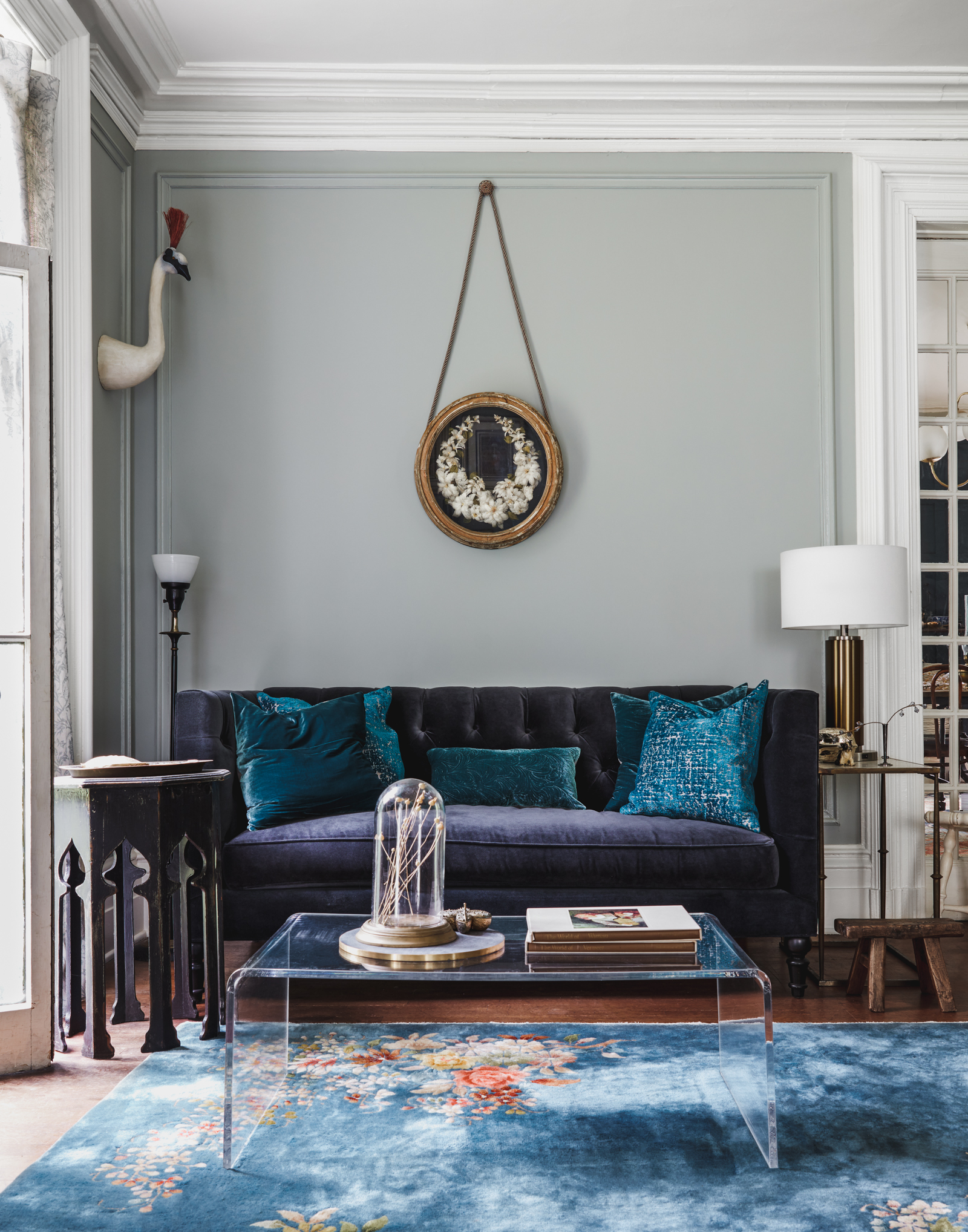
- The estate emulsion is a 2% sheen and looks so damn sexy on the walls, there’s a little something in the finish but this sheen soaks in the light and bounces the color right back. I visited historic British museums and noted the paint on the gallery walls, this sheen is the same vibe.
- The marketing and images are really inspiring. I can see this company puts a lot of value on the creative process from the team that creates the color, to the team who does marketing. Very strategic, speaking to the design community and design fluent consumers.
Cons
- Lots of technical issues. I’ve been in tears because of this brand of paint in my house and I just can’t forgive and forget. I’ve had cans of paint not mix down. The pigment and the sheen separated in the can and in the tray while we were painting. We had to drill mix several times. I’ve used their high gloss on doors and when it’s mildly humid, the paint becomes sticky and dust sticks to it. My black doors look *awesome* with the smallest amount of dog hair floating around. (Please note that’s dripping with sarcasm, a coping mechanism.) It’s really upsetting, I have multiple doors that need deglossing and repainting. When we painted the Queen of May room, we had so many technical issues, I can’t list them all.
- The primer is not good, skip it.
- You will need three coats of paint for full coverage. This is important because it takes more time and product, especially if you hire out painting.
- I would never use the ‘semi-gloss’ finish because of coverage issues. I used this on all our trim initially and wish I didn’t. The color is beautiful, love it.
- It’s expensive.
- Durability. You can’t wash or scrub this paint like you can others. I do and in some areas it has held up fine, in others it hasn’t. If you have kids or slobbery dogs, I’d think long and hard about your durability needs.
- The high gloss paint doesn’t fully harden, I will never use again.
- If you are not close to a store and need an extra gallon, you’re gonna have to have it shipped and wait.
- Difficult to use. You MUST drill mix. Not for a first time painter, IMHO.
- Doesn’t come in 5 gallon buckets, which if you’re working on an exterior or larger scale project, you have to order so many cans of paint.
Would I use it again? Yes, but with reservation. No, on trim or anything that needs a level of durability. If I really loved a color and was using it on walls, only with estate emulsion, I’d probably go for it. I don’t think you can dupe Hague Blue. Just sayin’.
Benjamin Moore Paint
An American paint brand dating back to 1883, they focus not only on color but on the science behind the paint. I’ve been using Benjamin Moore since I had my first apartment because the brand is sold at independent retails all over NYC, it was very easy to find. About 50% of our house will be painted in Benjamin Moore after we finish the third floor.
Pros
- The technical performance of this paint wow’s me every time. There are so many products that address issues – it’s amazing. Walls, cabinets, special primers, you name it, Benjamin Moore has it. This has saved me countless times from pure disaster.
- Easy to buy. I can find a shop that sells Benjamin Moore 20 minutes in several directions from our house. If we need an extra can of paint,we just run out and pick it up.
- Lots of colors. There’s so many choices – but keep up with me because I’m going to repeat this item below.
- If you want to look of F&B use the Aura Bath and Spa – it’s a matte paint meant for bathrooms. I don’t know what they used in the formulation of this product but I’ll spill the T: it looks very similar to the 2% estate emulsion from F&B. And… are you ready… I used it in our bathroom and scrub tooth paste off it all the time. This paint is rock solid. It’s really durable. So durable I used it in the hallway. And I keep using it. I have to note that I use it outside of the bathroom because it is more expensive but it’s SO durable and looks so good, I think it’s worth it. I think this is a rockstar product from BM and I don’t see it talked about with the attention it deserves. Spread the love.
- The Grand Entrance High Gloss Door paint is just beyond amazing. I painted an interior door (after my F&B flop) and this paint is my new go-to. It looks *just* like old fashioned oil paint. In a historic house, a must have. I’m going to use this when I repaint all the doors. The finish is so hard and durable, plus it doesn’t take long to dry. I used this in Bracken Cream – looks so good.
- Lots of primers depending on your needs. We’ve used them all and all the primers work really well.
- Excels with colors that have a green undertone. Some of the colors that have a greenish undertone look really great. That green pigment is a keeper.
- Very easy to apply and use overall. If you’re a newbie to DIY, start with this brand.
- Beautiful finish in two coats. Saves time and product.
- Price. Even BMs most expensive lines are better priced than F&B. Plus, you need less product because the coverage is better.
- Can customize very easily. You can use a percentage of a color because these are mixed at places close to home. I’d like to get into this aspect of the paint more.
- Available in 5 gallon buckets. We use two primers and have a 5 gallon bucket of each on hand. When we start painting the second floor hallway, I’ll get this color in a 5 gallon bucket. I find it easier to keep track of when managing renovation supplies.
Cons
- Remember when I said lots of colors in the pro section? It can be hard to find what you like and the room for error is large. I’ve spent more money than I care to mention sampling colors. I recommend starting with the Historic Color palette or the Williamsburg Color palette to start if you want that old world deeply saturated but soft look. Recently, samples are available via Samplalize and through the BM website.
- The red pigment sits funny with me. It vibrates too much and comes through when it shouldn’t. Depending on the color, this could be a big deal, especially with neutrals and soft pinks. Because of this, I sample alot making sure I have it right.
- So many colors are ‘brighter and vibrate more’ if you want that soft, desaturated look, you’re going to need to sample a lot. This get expensive. I recommend erring on the side of more desaturated than you think you’ll like.
- Marketing. Benjamin Moore serves so many areas of the paint industry from contractors to interior designers, it can be hard to find the vibe you’re looking for. F&B has a clear customer in mind with marketing, so it’s easy to say ‘I want that look!’, where as Benjamin Moore is so diverse with the corners of the industry they serve, as a consumer you’ll most likely search elsewhere to find your ‘look’. I spent over a decade in advertising and this is a massive area of growth and need for this brand.
Would I use it again? Absolutely, this is where I start when planning a paint project. The only thing that can lure me away is a specific color I don’t think can be replicated.
Thanks for coming to my talk about these two paint brands.
I hope this helps with your projects when choosing paint! We’ll continue painting at Stony Ford and renovating this old home.
I know there are many other paint brands out there, these are the two main brands I use and have a lot of experience working with.
Have an experience with either of these paint brands you want to share with everyone? Leave a comment below.
I loved this in-the-weeds detail info! (And it dovetails with my own DIY experiences, and the exasperated sighs every GC I ever had to tell that the client wanted F&B…). I’ve heard Sherwin Williams has done some amazing tweaks to their formulas in recent years, but I’m a Ben Moore Regal Select gal, through and through. Thank you for all this detailed info I can just send to family and friends when they ask me! Your color choices are always so gorgeous. May I humbly suggest, next time you need a soft off-black? Cheating Heart. It obviously has the greatest name ever, but it also has a lovely brown undertone that looks amazing with, well, everything. Can’t wait to see the third floor progress on IG!
Yes! Absolutely agree! Benjamin Moore is my ride or die. I, too, find the amount of colors overwhelming and difficult to pare down when designing a room however, I do sometimes end up with happy mistakes because of it. One thing I will note is that I’d recommend going to the same supplier for mixing. I’ve gone to about three different suppliers carrying BM all for the same color and each place has a slightly different “take”. Regardless, that Aura is no joke. I refinished my cabinets a couple years ago with it and dang, if it ain’t the best stuff!
I agree about the supplier! We have two we like and try to stick with a single supplier for a project.
this was super informative! I have had decent luck matching farrow and ball to benjamin moore. we color matched their “pink ground” for my daughter’s room and it looks great! do I think it’s exact? probably not but it worked for this project as I just needed it done (heavily pregnant). I often use F&B website for inspiration and colors that go well together!
Thank you so much for this overview – and secret sandwiched in there! I just love learning from you – written and video alike!
Thank you so much for this thorough review which jives with my experience of both brands.
Sadly, from the BM website: AURA® Grand Entrance®
Benjamin Moore AURA® Grand Entrance® paint has been discontinued as of August 1, 2022.
Hence we used BM ADVANCE® Interior Paint (waterborne alkyd) in semigloss which was/is astonishingly oil-like in both application and durability/hardness. No exterior version (yet?).
Thanks so much Susan and Will for the spot-on recs!
NOOOOOOOooooo! They can’t discontinue that paint. I’m going to hoard it, see if I can still get it.
Yes thanks for all the info!! I’ve been using F&B recently, no technical issues at all. Agree 3 coats is necessary. I’m really excited to try your Aura Bath paint suggestion!! Husband hates the FB concept so I’ll see if he’ll onboard with the new-to-us brand. I’m also glad you mentioned color matching and that you wouldn’t. I fully agree. With allll the colors BM offers, why would you try for a wonky match.
Anyways, thanks for this. Talking paint & color is FUN (even if my friends and family disagree I still have my insta friends!) best of luck and energy for your 3rd floor!! Xx
I second the “secret” in your stories! I loved the Aura finish in my bathroom so much that I used it in a recent guest room/office update. Thanks, as always, for another brilliant, in-depth post. 100% always here for it!!
Thank you for this! Benjamin Moore truly seems superior to any brand I’ve tried. Admittedly, I’ve never used F&B though I love their colors (and their IG presence). You hit the nail on the head with the marketing! Yet it’s never swayed me from sticking with the reliability of BM products. Your rooms all look stunning, btw. Can’t wait to see the third floor transformation!
I had never used BM, but when we moved into our house this summer, I noticed how nice the hallways looked, and found the BM Aura can in the basement. I used it in our bedroom, and was absolutely amazed that it was
truly a one coat paint.
I agree with you that colors are overwhelming and Ive been sticking to Williamsburg or Historical. They’ve all looked great so far.
I adore all the paints you have chosen for your home so this was a real treat learning from an expert. And, thank you for putting it in blog format so that I can refer back to it. You two are inspirational, thanks for sharing.
So glad you mentioned that the F&B high gloss never really fully cures! I agree! We painted shelves in our dining room and 3 years out they are still tacky. I even called the store to ask what to do. They were no use. Thank
goodness it’s not a high use area. It looks amazing and I would probably do it again even with the difficulty. But it sure bugs me!
Thanks for this post it’s so interesting to read about your experiences. I remember you telling me about the doors and how upsetting that was when we saw each other last.
I will say F&B paint cans are the worst! If you’re a brush painter and paint direct from the can like I do, the paint can will rust and the rust particles drip into the can! Maybe I’m being lazy in skipping a step by not pouring into another container but I never have that issue with Ben Moore cans. I’ve never had an issue with the glossy paints from F&B. Our scullery is the modern eggshell, as is our trim and power room and I love the finish. I also found while it drips more than BM paint, the drips easily brush off and the paint dries quickly. I have also found the dark primer helps with coverage and using less coats. I used a normal primer in the scullery and that took 4 coats. In the powder we used FB dark primer and it only took 2 coats! I could go on… but thanks for this informative post! I love reading others’ opinions on the two brands.
This is great info! I’m relieved to hear I’m not the only one struggling with getting BM colors right, I’m on my 7th sample of mauve and I’m losing faith. Also, I was tempted to try F&B thinking a more expensive paint would be more durable. Guess not!
This was very informative and I appreciate all the detail on why. There’s too much on the interest that’s “pass pass smash” and it’s great to read more about the why’s.
We use BM Aura Bath based on your past recommendations and love it. It’s a tough cookie!
I painted my southern knotted pine in Hague blue high gloss. About six coats and it’s never really dried. It looks amazing especially at night. I feel like I’m in a galley of an antique ship. Things still stick like dog hair. I have to vacuum my walls. I used pigeon in a bathroom. Color is great but the after a shower is horrible. I’ve used BM moving forward in all bathrooms. But I keep going back to FB. I color drenched my moms living and dining rooms in Cromarty. It’s beautiful. I did my own in green smoke and the pigments are stunning in a room which gets east, west and southern light during the day. The downpipe on the trim is another story. This post taught me so much about my own experience. I tried Clare in a bedroom and I have to say it was awesome pigment and coverage. You can’t go to a store like BM but it was fast and the color consultation helped me pick color for the right type of light. So for non pros like me it was helpful.
I love my local Benjamin Moore store and I love their paint. I agree that anything with a hint of red is a bother. No matter the brand, I find it difficult to find the right color – especially when factoring in the amount of light and time of day. Lately I’ve taken to mix my own shades with samples. The store works we me to fine tune it. I have them make up a quart and paint sample boards which I move around the room during different times of the day. This is extremely helpful. Especially with the whites as they as they are notorious for turning green, blue and yellow in the evening I once painted my kitchen with what I thought was the perfect neutral white only to find it turned lilac around 6pm.
Fascinated and obsessed with color as well. Great article, incredible detail.
Agreed that F&B can’t be matched on color and once you like one of their colors nothing else will do. But I’m curious …Behr Marquis ??? It’s my go to …. i’ve used it on everything and anytime I try SW or BM I always always always go back to Behr.
Just wanted to say thanks so much for this post! As a newbie to painting, I’ve been struggling with whether to splurge on F&B or just go for BM. Exactly the post I needed.
Great comparison between the two paints, thank you. Friends have FB Railings (#31), estate eggshell (20% sheen) on their stairs, handrails, and
support base – it looks fantastic. My local BM store says they can colour match, but I’d rather buy BM’s Aura or Regal paint. Would you or your readers have any BM colour that resembles FB’s Railings colour?
Thank you. This is very informative. We’ve been in our little (1008 sq ft) 1920s craftsman bungalow in NoCal for 20 years and are starting some major renovations. I’ve been eyeing Farrow and Ball because of the beautiful colors (we had Kelly Moore and were very happy, but they’re out of business), but it seems that F&B is for professionals given the technical issues. So we’ll go with Benjamin Moore and there is a store just a couple miles from us. Also just discovered your wonderful website from searching for a comparison of F&B and Benjamin Moore. Will be back for more!
I’ve never tried BM but I have used F&B and I thought it was terrible. So much so I’ll never use it again and warn anyone away from ever using it as well. And painted ceilings? No. Just no. It’s simply too much.
Extremely helpful! I’m always vacillating between these brands and the various finishes and this will make decisions so much easier
Love this honest review , we have used BM since we painted a wood clad villa in New Zealand , 20 years ago , visited 10 years later and the new owners said they hadn’t need to repaint . Since moving to the Uk recently we have continued to to use BM. The supplier was surprised that we chose this as non professionals as the trades prefer it over FB for application . We love the colors and durability
We have our professional paint store (they serve painting pros and decorators, as well as civilians) make up F&B colors in Benjamin Moore paint, and we haven’t been disappointed thus far. We have fanbooks from both brands, as well; totally worth the investment.