Living Room Make Over
Are y’all ready for a living room make over? We’re collaborating with West Elm and Rejuvenation!!! Many months ago we started thinking about decorating and designing our living room. As bloggers and Instagrammers we have companies reach out to collaborate, but it doesn’t always align with the content we’re interested in. We thought: why not turn the tables and ask our favorite companies, the ones we shop at anyway, if they want to collaborate with us? At the top of our list was West Elm and Rejuvenation. Rejuvenation has an old home focus and a nod to the past in their designs, and West Elm takes a modern approach to design which is also a huge part of our style. We’ve already included their products in our home before this project so we knew they’d be a great fit. When they said yes, we were super excited! We figured it would take about three months to complete this project project and we hope you truly enjoy the journey. And a big thanks to West Elm and Rejuvenation for collaborating with us.
Can you believe we’ve been in our home for three years now? It still fells like yesterday that we moved in. Taking on your first home or apartment can be a huge endeavor. You run into the project full of gusto and find out the things you have to do verses want to do. Our home, like many others had a little more of the “have to do” less of the “want to do”. But this actually helped us live with our house and figure out what we really want to do with the space.
We’ll share the entire process with you, the good, the bad, everything. I’ll make sure to tell you how many times we second guess our choices, go back and forth on ideas or change our minds. Lets focus on the process because even if your design style isn’t the same as ours, you’ll still be able to learn something that helps you in your own home. We’re huge believers in unique, personal homes. Your home should reflect who you are, what you love and your personal history.
Goals!
I’m a big believer in goal setting and use this as a compass during the project. Consider doing this at the beginning of a big project – it keeps you honest. When I think about what I want our living space to look like, it has to be the perfect balance of opposites. This is a formal, grand house, yet we are casual people. I’m ok with being a little formal in some areas and being casual in others. We want to honor the house by having some furniture that’s historic-inspired or antique, and also want to have modern pieces that represent us and the time we live in today. We need to show a maximal-minimalist aesthetic that we struggle with. We love stuff. Lots of it. But we also think the eye needs a place to rest. Our living room is so minimal right now, this will be a good challenge for us! The biggest part of our design goals is story telling. We think homes should tell the story of that space and the people who live and lived there. Our house had a lot of past lives, from Charles Backman in the 1860s to Les and Fred in the 1950s. We want to make sure to give them a nod for keeping Stony Ford up and running, so we can enjoy it today.
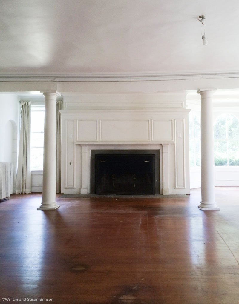
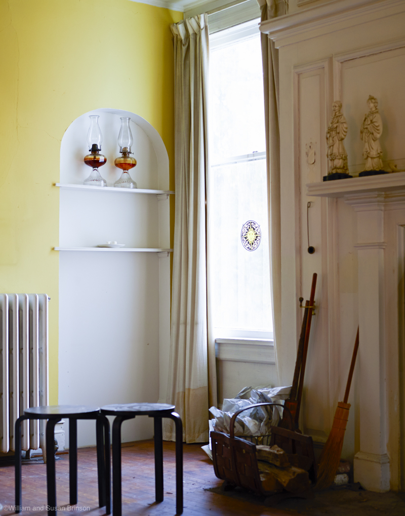
The before pictures!
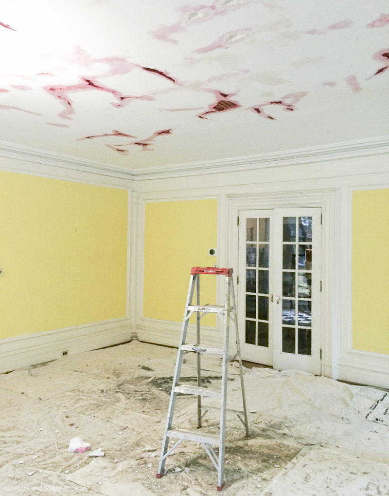
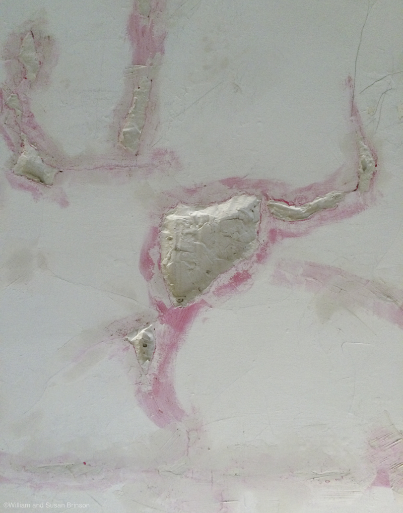
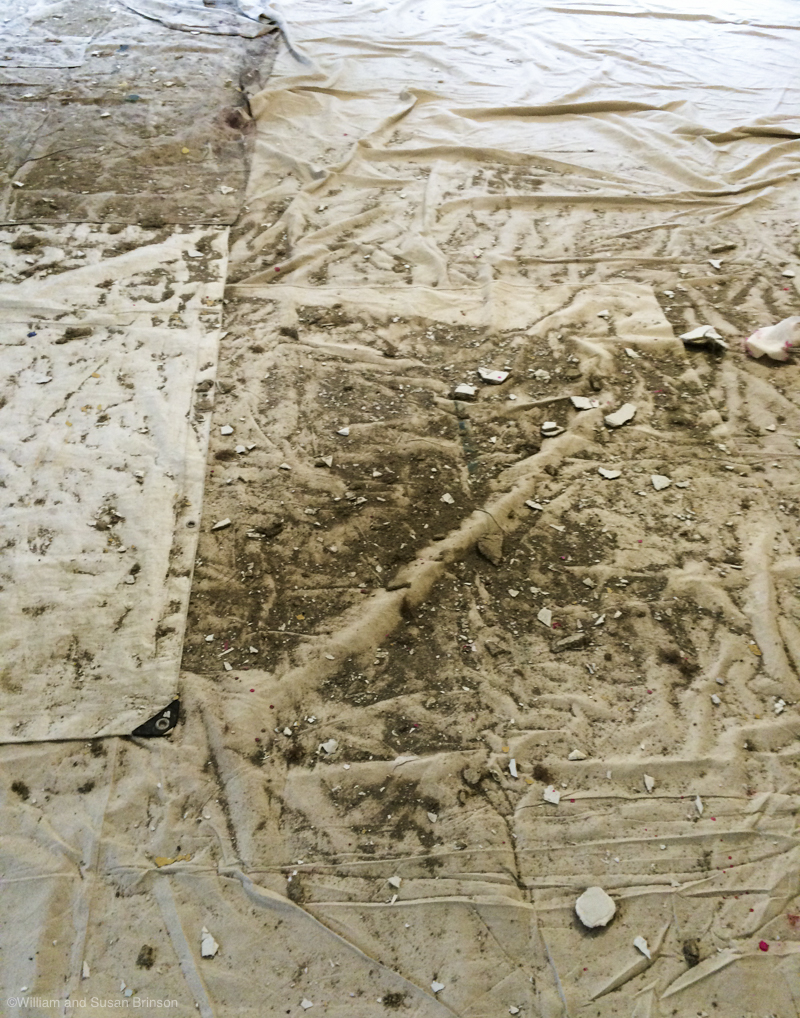
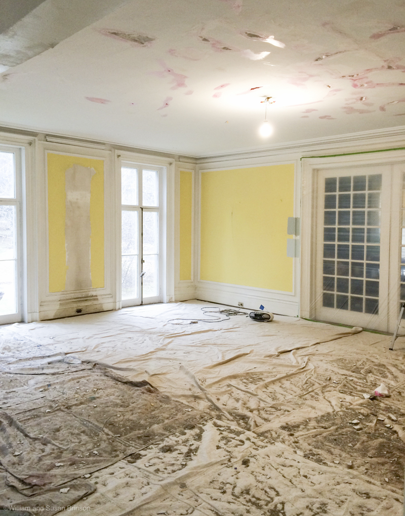
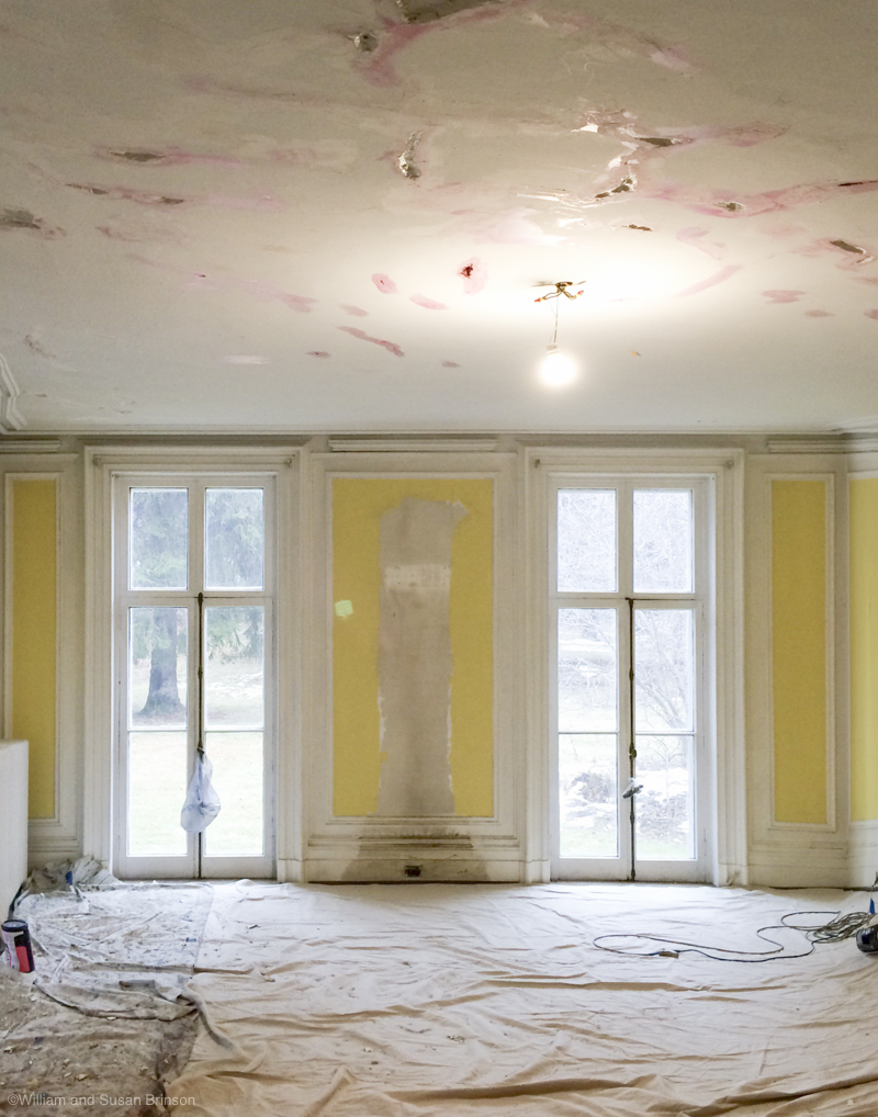
Yikes! Can we say: yellow? Color choices are super personal, and we prefer cool tones, especially in such large spaces. We spent about two months stripping two layers of wall paper from the insets, and reskimming the plaster on the walls. It’s dirty, not fun work, but it must be done. We’d rather put in the sweat equity here, and splurge in other places. We’ll get to some splurges later. When I’m spending on an item I might find expensive, I’m going to remember being covered in plaster dust and wondering if there is any more window casings that need a coat of paint. The sweat equity eventually pays off.
Where we’re at today
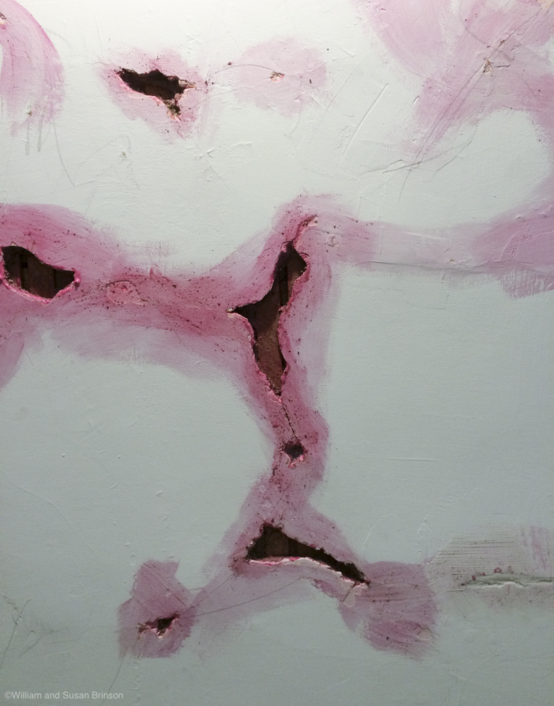
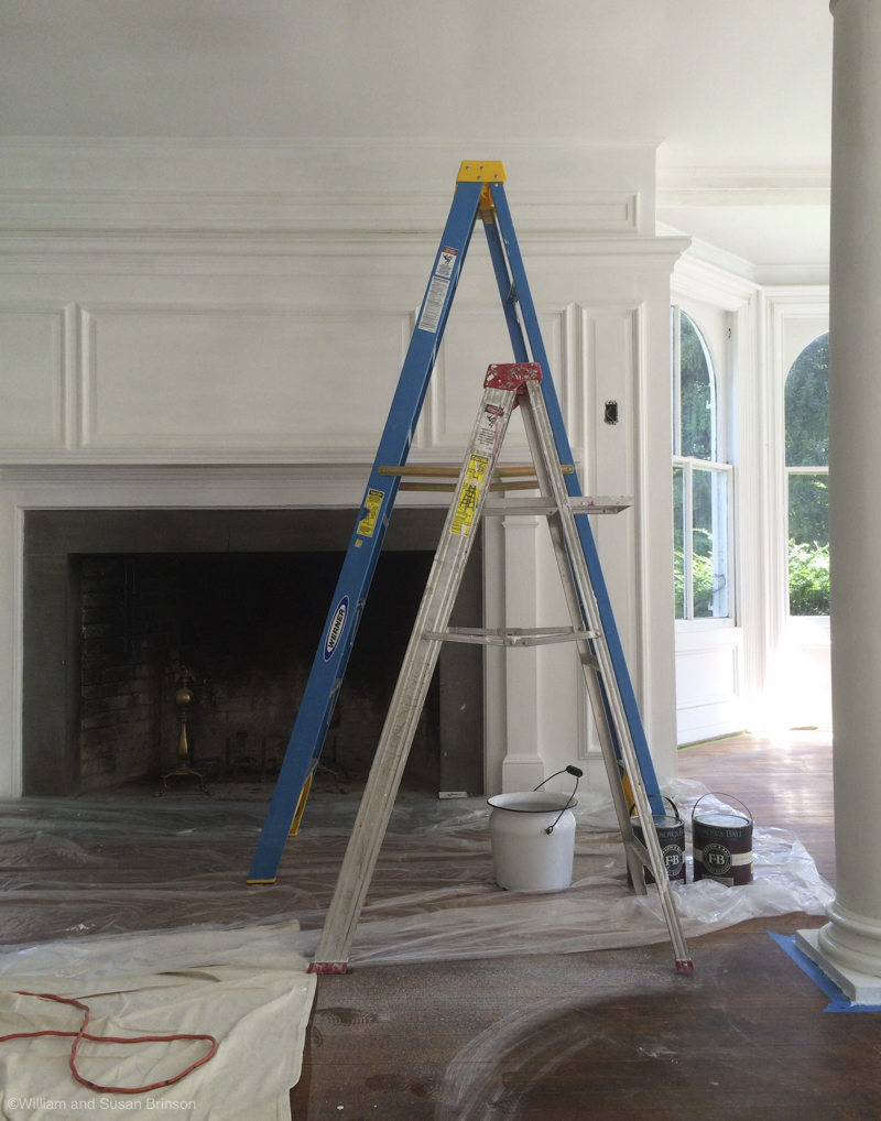
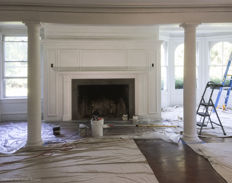
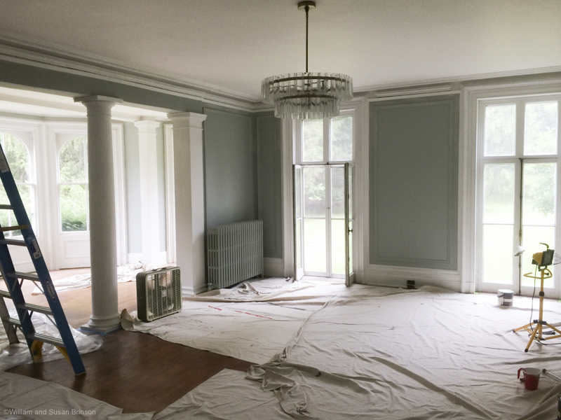
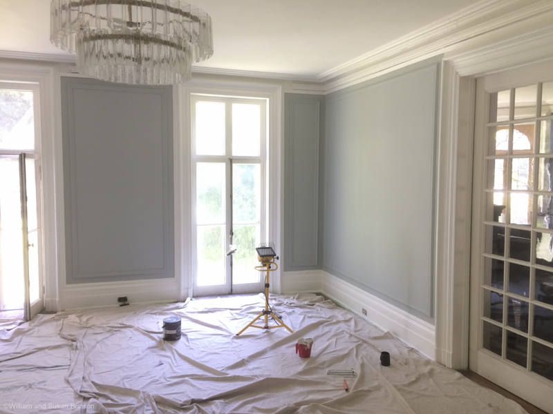
The work we’ve completed in the room today is prepping and painting the walls. We also had the ceiling repaired and skimmed. We still have much to do. Renovation doesn’t happen over night — this paint job was completed last summer. We’ve had a lot of time to think about the way we want this room to look. One thing I’d highly recommend — we’ve lived in the room and noticed how our guests use the room. What areas get used, which ones are neglected. We’ve also watched the traffic flow because this floor plan is pretty ‘open plan’ even though it’s an old house.
Color palette: I know a bunch of you are going to ask about paint color. Sources for furniture and paint are the most popular questions we get here and on Instagram. Our dining room is painted a very dark color (Farrow and Ball, Hague Blue) so when we painted the living room we wanted to go with the opposite and went with a more neutral, light color (Farrow and Ball, Light Blue). We used Farrow and Ball because they have paint finishes that are a bit more historic in nature, like the estate emulsion. When selecting furniture, you’ll see us have some items that have a big color statement, and some that are neutral.
Future plans
The living room is the largest room in the house, so we use it a lot. I thought it would be easiest to break out pros/cons with the living room so you can follow how we see the space.
Size: The best and worst feature of this room is the sheer size. Did you know we had a Manhattan apartment smaller than this room? No kidding, us city people don’t know what to do with a room this big. The size and wow-factor of this room is one of the reasons we bought this house. We looked at a lot of Victorian houses that had smaller rooms and they felt very cramped, so when we saw the layout of this room and house, the deal was done. Because we are overwhelmed, we’re going to ask for help with the layout of the room and how it functions. We’ll take a stab at it ourselves, then get some professional opinions and see if they have other ideas that we didn’t think of.
Examining our aesthetics: Defining how we want a space to look is a good challenge – we’ve been inspired on Pinterest for sure. I’m a big believer in personal style and I’m very conscious as to why I’m attracted to certain things. Do you ever find yourself getting sucked into a trend vortex? I find myself appreciating other peoples style or a trend, but I rarely see a style and think: yes, that’s me! It’s a bit of soul searching. I like spaces that have a sense of the human hand, and imperfectness. If it looks too sterile, I’m not into it. We want our house to look lived in. I’ll post about this more – I love following the homes of taste makers to see how they live, or translate their personal style into their home.
Will we, or won’t we?
No promises but we are considering three very important fixes to the room. I have yet to research price, timing, general realistic-ness of these projects.
Ceiling medallion: We had the ceiling reskimmed but never addressed a medallion. The original one was removed, so we have to get a new one. Because the room is so big, so is the medallion. A small 20 inch medallion isn’t going to do the trick here. Also, I think the medallion will be a custom order. I’m going to do some research and see how feasible this is.
Floors: The floors need redoing some kinda awful. Like really bad. When we moved in we peeled up newspaper that was stuck in the finish of the floor. Plus we found out the large black stains were from a leaky tractor the pig farmer had in here. I guess in the 1930s this house was better used for farm equipment storage? If we tackle the living room, we need to consider the dining room and hallway as well. The ‘open plan’ of the pocket and french doors make it necessary to address the downstairs as a whole.
Windows: Strip paint, remount hardware, replace broken glass and repaint windows frames on floor to ceiling windows. We love these windows and they need some TLC. Window restoration is time consuming and costs can stack up.
Whew! This is a long one! That’s where we’re at today. If you want to play-by-play, follow us on Instagram plus we’ll be posting lots of Instagram Stories. You’re with us when we go shopping, antiquing, and making design decisions.
For a sneak peek at the furniture that we’re considering for the space, follow us on Pinterest and see our board for the project here.
This post was sponsored by West Elm and Rejuvenation. Opinions are our own. Thank you for supporting the sponsors that make this content possible.
You guys! This is going to be beautiful. I really love your color choice and look forward to seeing the finished project!
~e
That colour is divine! And I vote for a medallion for sure!
xx, http://sabrinasmelko.com
Thanks! We’ll see how the install goes! 🙂
Somewhere I think in an Instagram story you where choosing between several large black and white animal photos. I can’t find anything on that, who was the artist? Thanks
Yes! I put Bran Ford’s work on our Instagram stories. We’ll show the final piece in the reveal images. Brad’s site is Kingdom Animal Prints. The print looks amazing in person. We went with a simple white frame. 🙂