Color and Lighting in Our Home: The First Floor
This post is sponsored by Soraa Home. All opinions our own. This is the first post in a three post series about color and light in our home.
I’ll tell you a secret: We bought this house because of the windows and daylight. As photographers we know how much light can influence your environment. Whether it’s daylight or artificial light, your mood is transformed.
Seeing that I live with none other than Mister William Brinson, who is lighting and light bulb obsessed. (We’ll save the weather and temperature obsession for another blog post.) Will is the person who talks about light bulbs for 20 minutes. I’m not joking – raise your hand if you do it too! When energy efficient light bulbs first came on the market years ago, Will was an early adopter. But he said our apartment was too ‘blue’ and it looked like a morgue. He was totally right. But on the flip side, most light bulbs are too yellow. It’s best to have a soft, neutral light. Say hello to Sorra Home. Energy efficient, LED light that’s full spectrum.
In our day-to-day life as photographers we color correct and temperature shift images all the time. It’s the number one correction we always make to our images. We think of our home the same way and choose how we use color and lighting in our home very specifically. The paint we choose – we look at undertones carefully. We look at color in daylight and artificial light. The artificial light is just as important as the daylight – time change is around the corner and it’s dark most of the day.
Let me tell you about Soraa Home and why we wanted to incorporate these in our home. I walk into museums and the lighting looks SO good. Clean, fresh and the color on the art work is on point. Soraa lighting is in the V&A Museum in London and, ya know, the Palace of Versailles. Knowing that we could get museum quality light at home, we’re in.
Exploring Color + Light
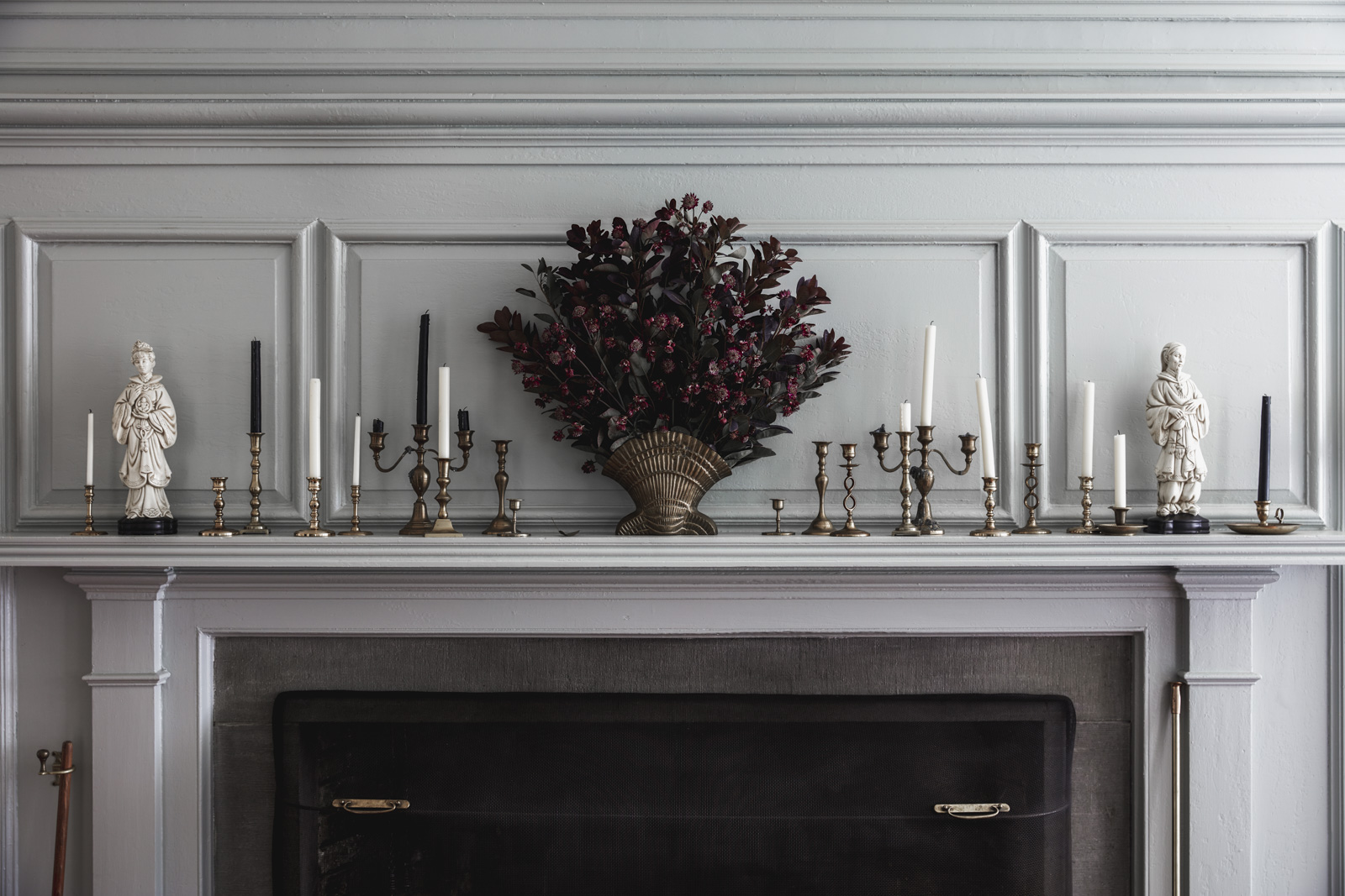
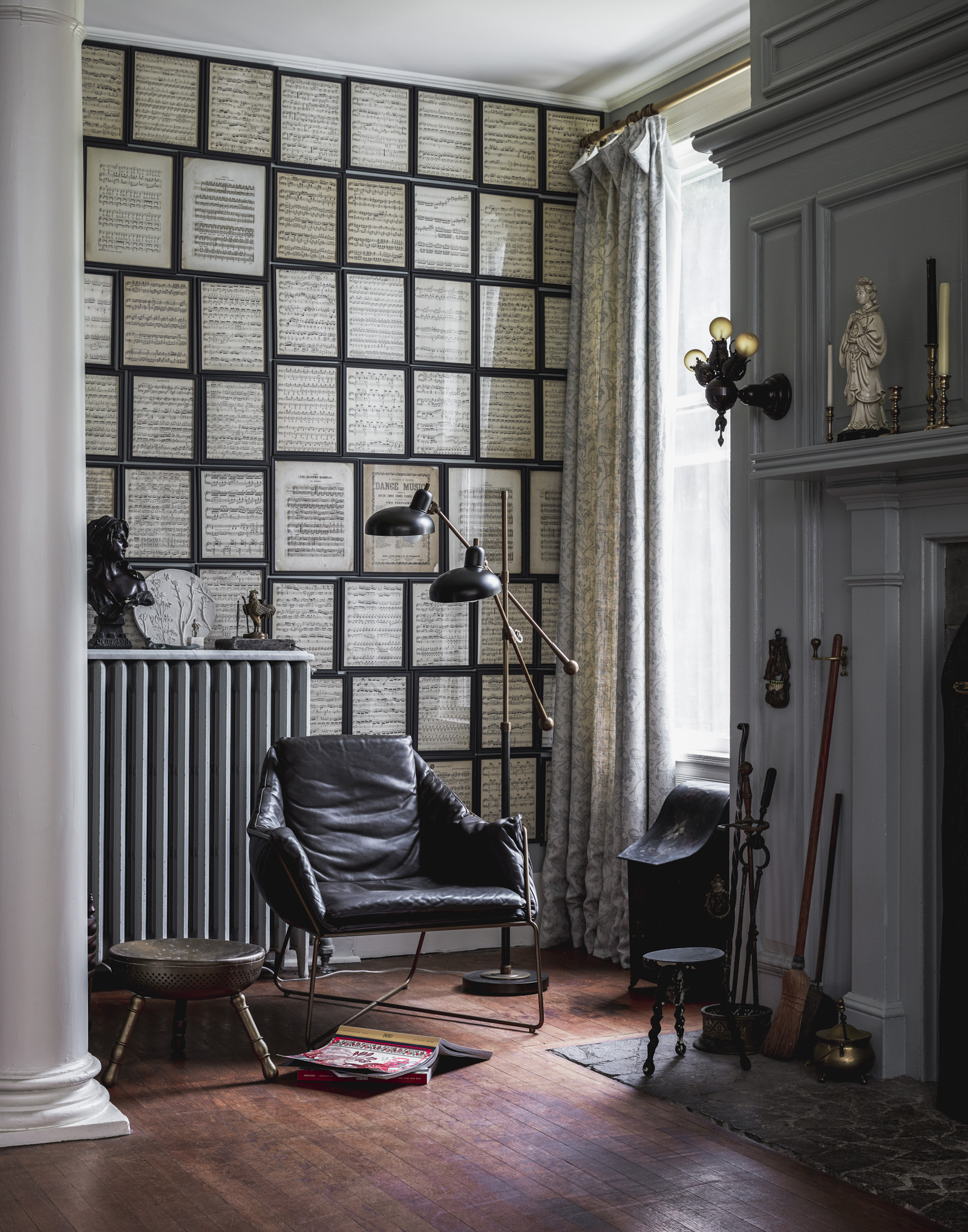
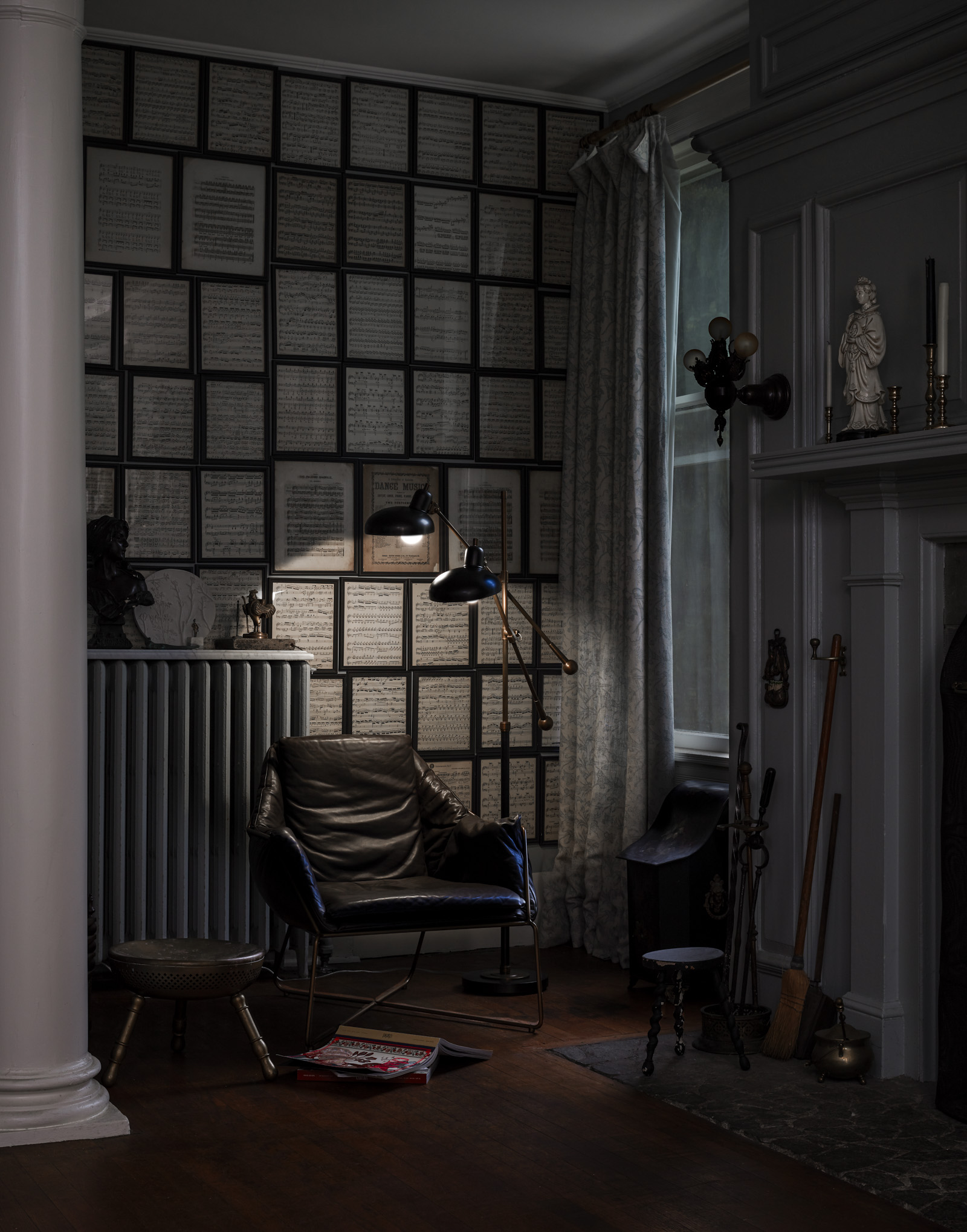
We’re sharing some vignettes of our first floor, and next week we’ll do the second floor, followed by the third. I’ve planned the color palette for the entire house, which requires a big picture vision and careful consideration. Here’s where we’re at today, with some spaces completely finished and some still in progress. We’re sharing images of daylight and dusk so you can see how the mood of the room shifts.
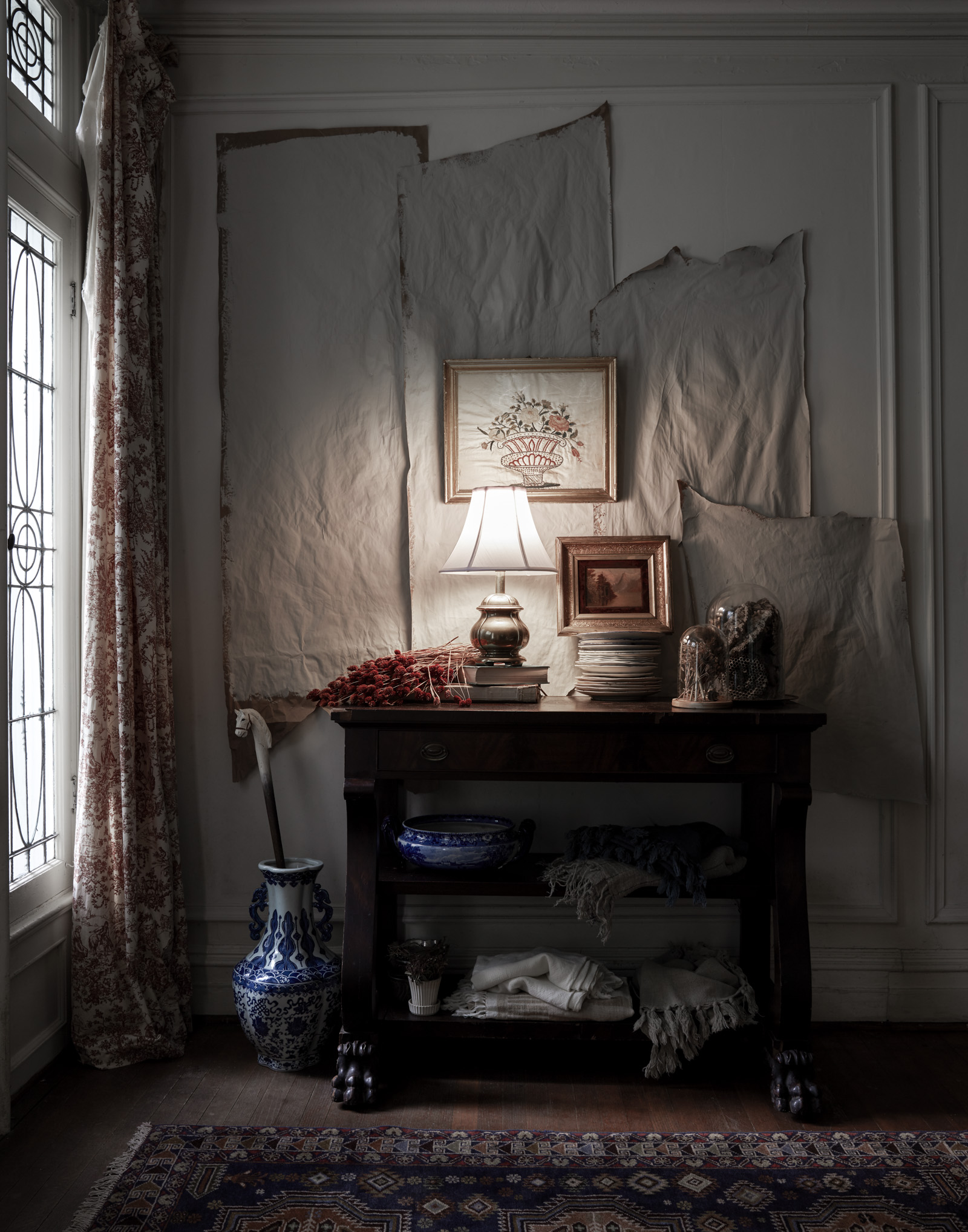
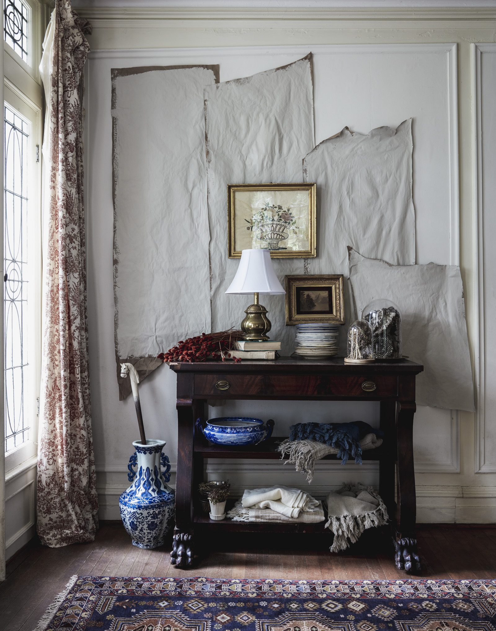
Let’s start in the hallway. The hallway spans three floors and has to weave it’s way through the entire house. We haven’t tackled renovating the hallways but we do have the color palette planned. While most rooms are a strong color, the hallway and two common bathrooms will be neutrals. Imagine coming out of jewel box rooms with strong color and transiting into a soothing expansive hallway. The hallways are a bone color with accent colors that tie into the other rooms, like blue and orange.
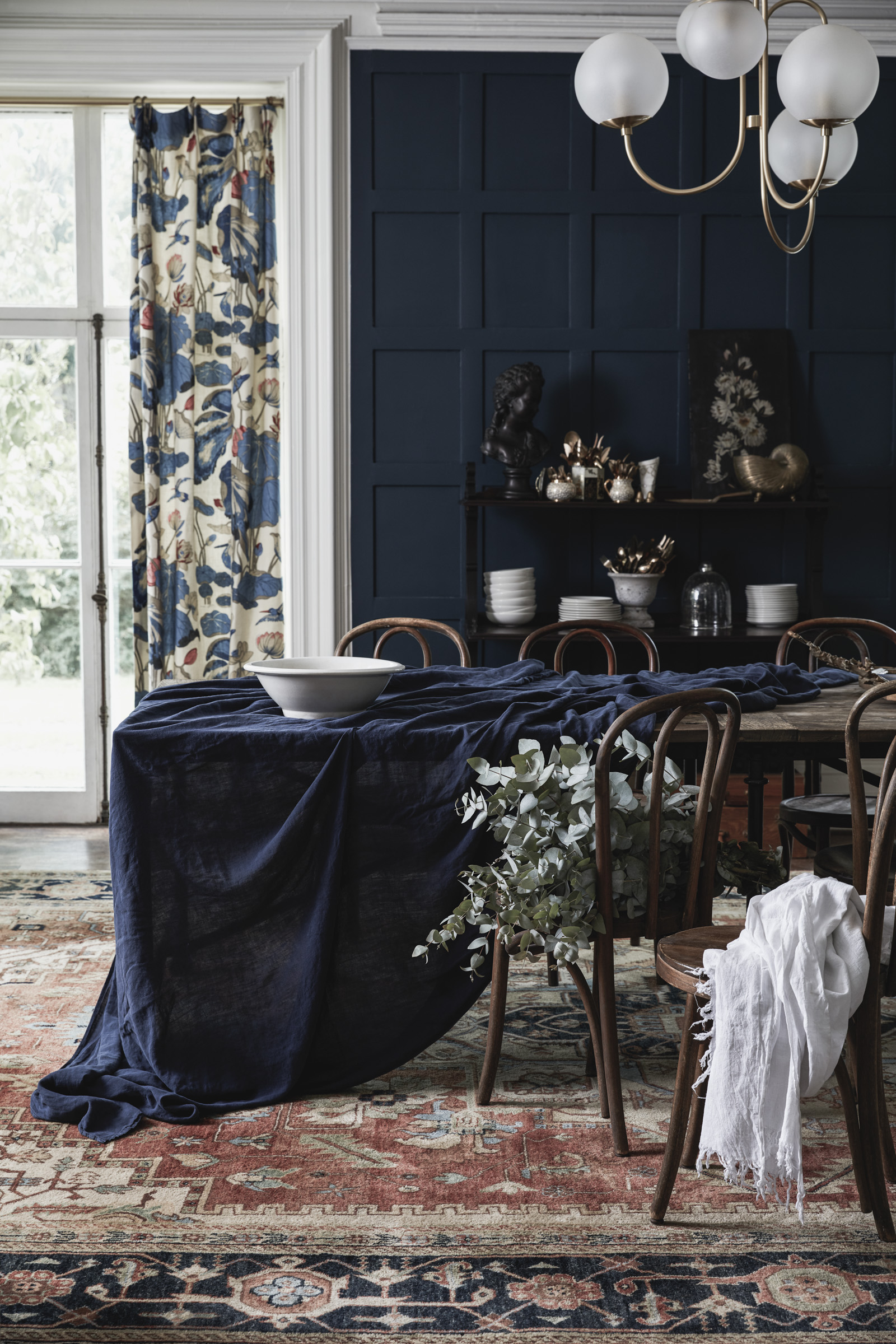
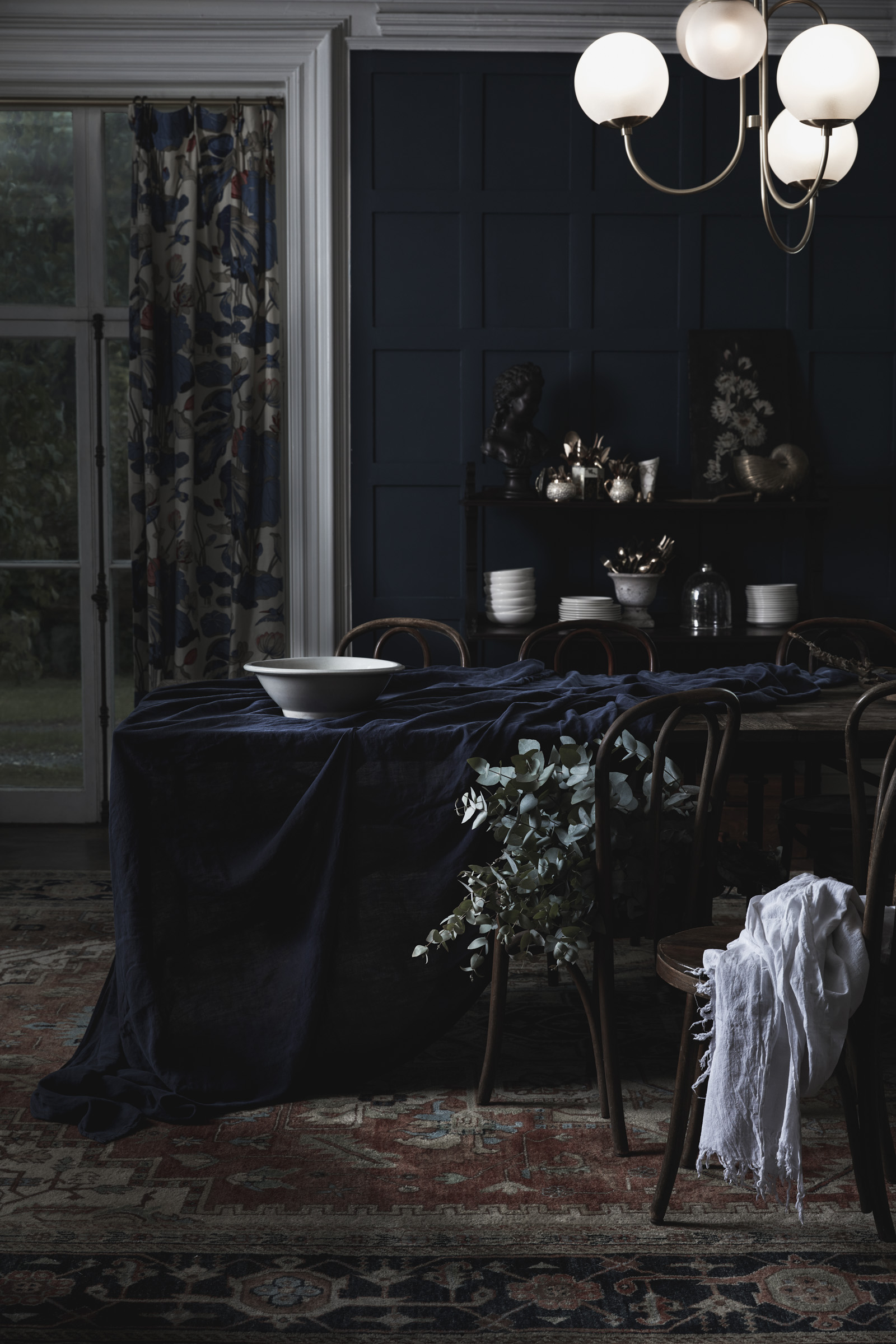
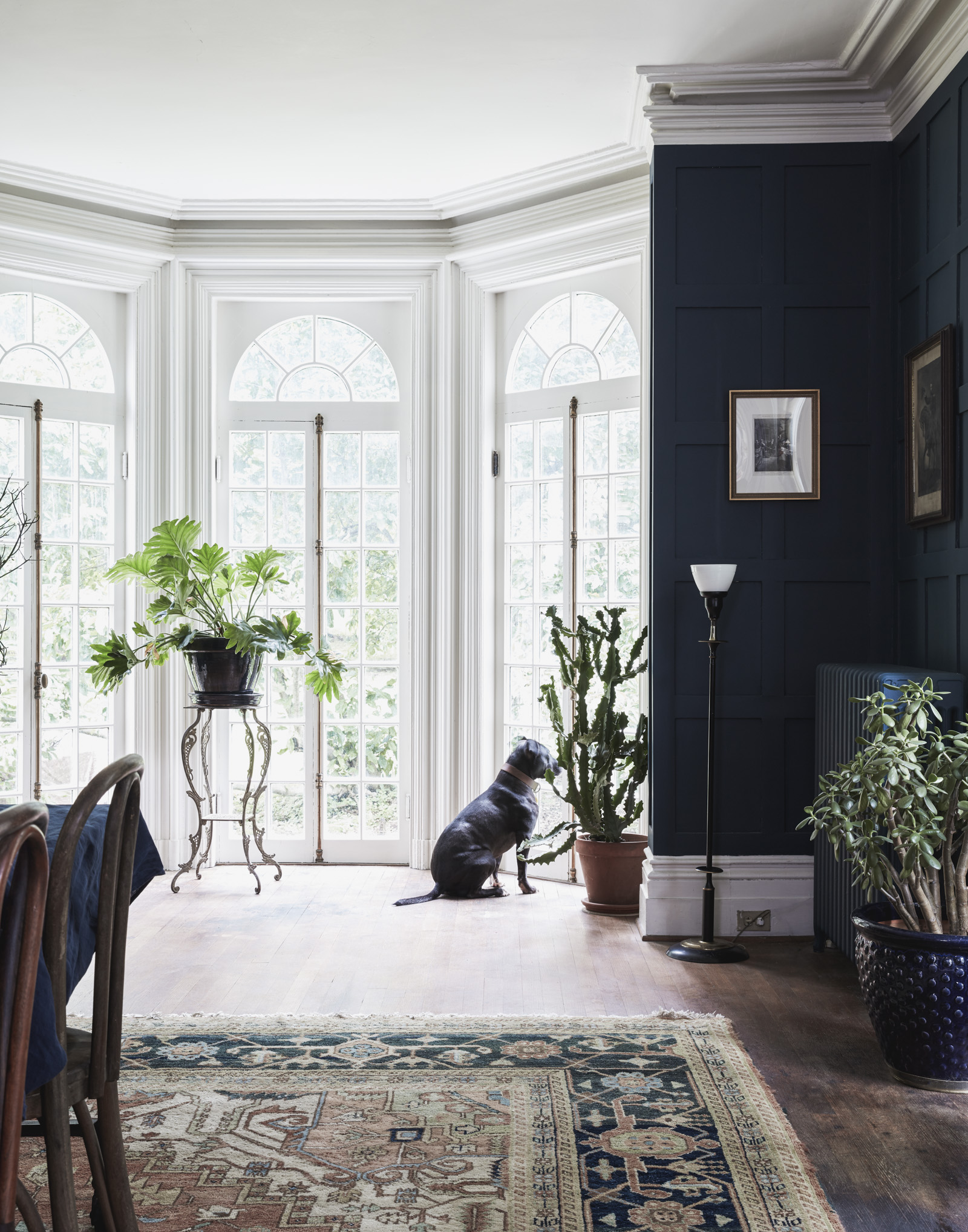
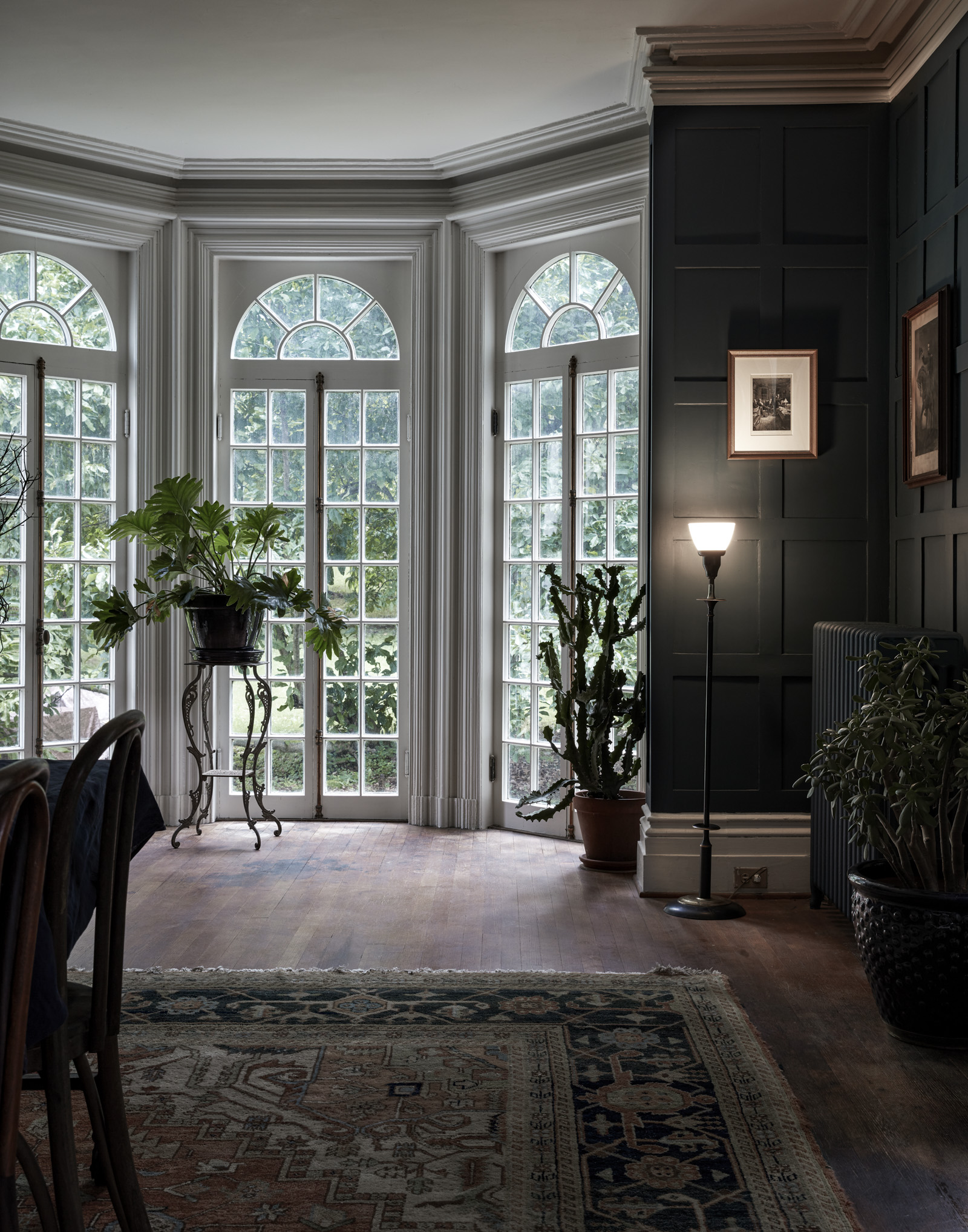
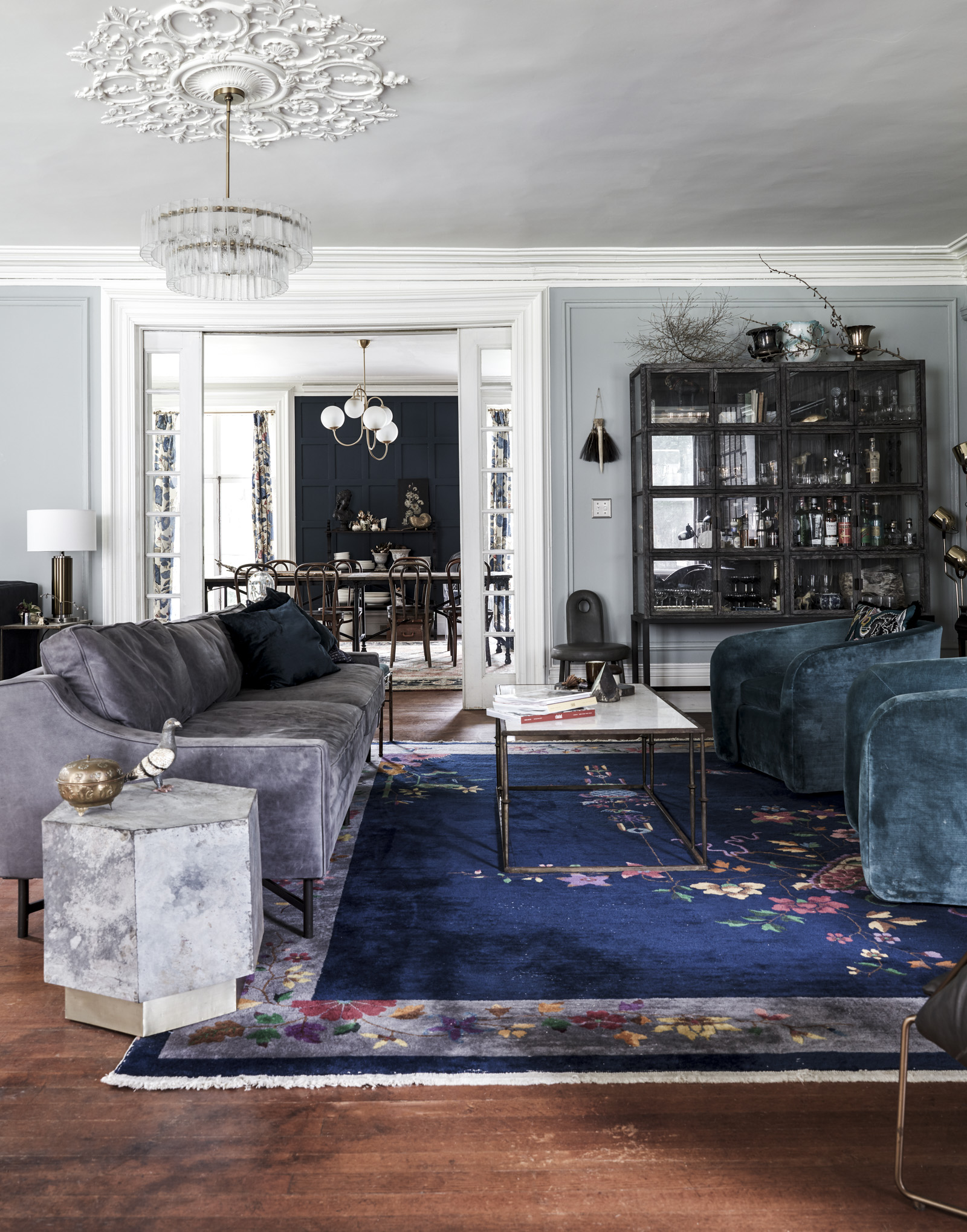
Our dining room is half finished. We have to buy more furniture for the space, but we still enjoy entertaining larger parties in here. It’s also my mini atrium where all plant life survives. There are five floor-to-ceiling windows in this room so we went with a dark, navy blue. The room can handle a color this dark because of the natural light, and in the winter it becomes a cozy place to enjoy a homemade dinner.
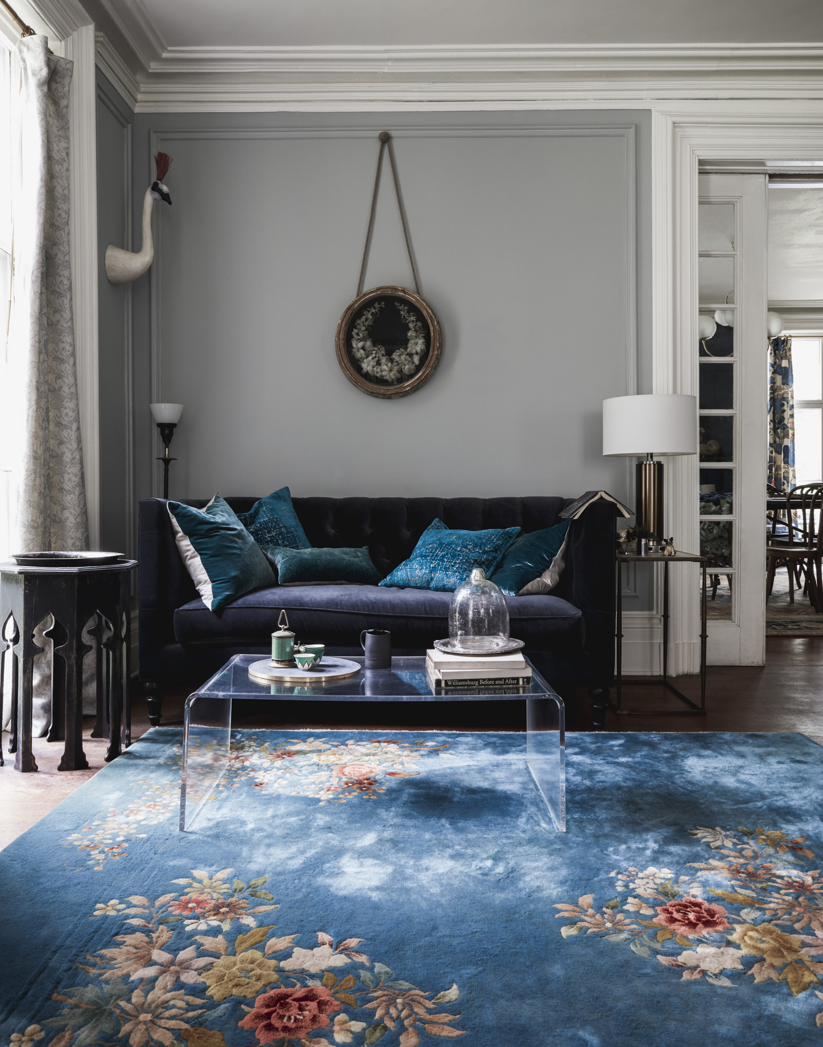
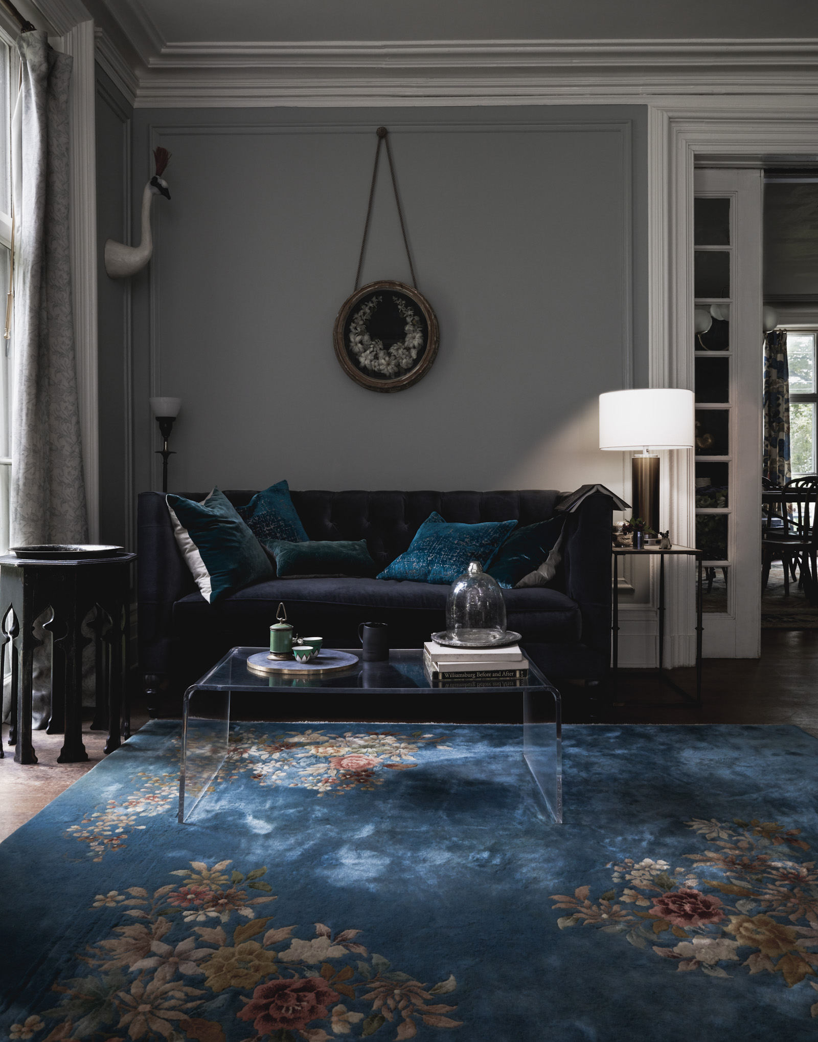
In the living room we share our favorite nooks, where we read or just hang out listening to records. We went with a light blue that looks blue in the summer and greenish blue in the winter. The undertones really shift depending on the season. We accent with textures in the room of navy blues to tie into the dining room, which joins the living room with pocket doors. There are two vintage Nichols rugs that add color and interest to a mostly neutral room.
Next week we’ll take a journey to the second floor.
This post is sponsored by Soraa Home. All opinions our own.

Your decorating style gives me life! Yes to all the color and drama and moodiness and thank goodness it’s not all white and coastal like every other design blog out there! I want to package your entire rooms and install them in my house!
Thanks! I think the all white look is a hard one to pull off. Look out in a few weeks when I post the third floor (one room will be white for a photo studio). It’s had for me because many of the white rooms I see don’t look intentional. They look half done. I’m trying to figure out how to make sure when I HAVE to do a white room, I love it as much as the rooms with color. Should be a good study in design theory.
I wanted to kiss my computer screen when I saw the first evening photo. <3 <3
Alright, you get ‘best comment ever’! Made me smile.
Your home is perfection.I just love it so much <3
Thank you! 🙂
Very interesting post about basic thing in coloring and lighting, Good job and thanks for sharing such a good blog. It’s very useful to us.
Hi Susan! Your home is so lovely and is a constant source of inspiration for me as my husband and I restore our 1870’s Pittsburgh rowhouse… I did have a few burning questions about the soraa lights, do you use different bulb temperatures and lumen output for different rooms? If so, what would you recommend?
Thanks for you question and kind words. We use the no blue lights in the bedroom and the regular in the common rooms. We also use the 60 watts for the main lights. For accent lights they do not have the 45 watts, so we use a neutral color bulb for those lamps.
Thanks so much for the quick and helpful response!
Never knew lighting could change the mood of the interiors so dramatically. Really inspiring ideas!
I love the color schemes, esp the dark blue. What paint brand and color did you use for the dining room?